


Lighting + Color Psychology
How Designers Can Transform Mood & Space in 2026

Design isn’t just about how a space looks. It’s about how a space feels.
In 2026, clients are no longer asking for “nice lighting.” They’re asking for spaces that feel calm, energizing, welcoming, cozy, focused, or restorative. They want homes that support how they live—and lighting is one of the most powerful tools designers have to shape that experience.
Color psychology has been around for decades. But when color and lighting work together, the impact multiplies. Lighting changes how color is perceived. Color changes how light is experienced. When designers understand both, they move from being decorators to storytellers.
Think of lighting like music in a movie. The same scene can feel peaceful, tense, or joyful depending on the soundtrack. Lighting does that for interiors—and color is the instrument it plays.
This guide shows how designers can intentionally use lighting + color psychology in 2026 to transform mood, guide behavior, and help clients feel the difference the moment they walk into a space.
Why Lighting + Color Psychology Matters More in 2026
Several trends are converging:
Wellness-focused design is now mainstream
Clients want emotional connection, not just aesthetics
Work-from-home and hybrid living continue
Homes must support multiple moods in one space
Designers are expected to explain why design choices matter
Lighting and color psychology give designers language, intention, and authority.
Instead of saying: “This looks nice.”
You can say: “This lighting and color combination is designed to help you unwind at night and feel energized in the morning.”
That’s powerful.
The Science (Made Simple): How Light Affects Mood
Light influences the human brain in measurable ways. It affects:
The two biggest lighting factors that influence mood are:

1. Color Temperature
Measured in Kelvin (K), this determines whether light feels warm or cool.
- Warm light (2700K–3000K): calming, cozy, intimate
- Neutral light (3000K–3500K): balanced, clean, versatile
- Cool light (4000K+): energizing, alert, task-focused
2. Brightness & Direction
- Soft, indirect light relaxes the nervous system
- Harsh, overhead light increases alertness and tension
- Layered lighting creates emotional depth
When you pair these with color, the emotional impact intensifies.
How Color Psychology Works With Lighting
Color alone doesn’t tell the full story. A wall color can feel completely different depending on the light hitting it. Here’s the key principle designers should remember in 2026: Lighting doesn’t just illuminate color—it interprets it.
The same paint color can feel warm, flat, vibrant, dull, soothing, or sterile depending on lighting choices.

Warm Colors + Warm Light = Comfort & Intimacy
Colors:
- Warm whites
- Creams
- Beiges
- Terracotta
- Soft browns
- Muted reds
Best Lighting:
- 2700K–3000K
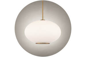
- Lamps, sconces, indirect lighting
Emotional Effect: Cozy, grounded, inviting, safe
Best Spaces: Living rooms, bedrooms, dining rooms, reading nooks
This combination tells the client: “You can relax here.”

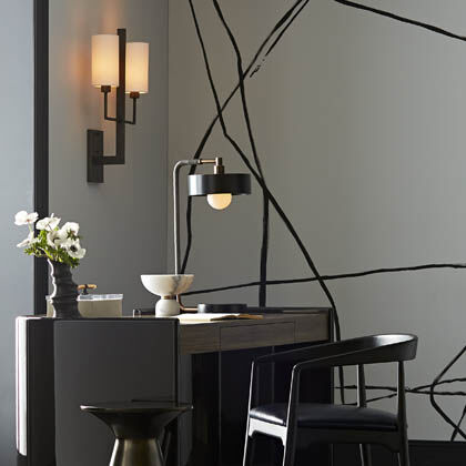
Cool Colors + Neutral Light = Focus & Clarity
Colors:
- Soft blues
- Cool grays
- Muted greens
Best Lighting:
- 3000K–3500K
- Even, glare-free illumination
Emotional Effect: Clear, calm, focused
Best Spaces: Home offices, kitchens, bathrooms, laundry rooms
This combination says: “This space helps you think clearly.”
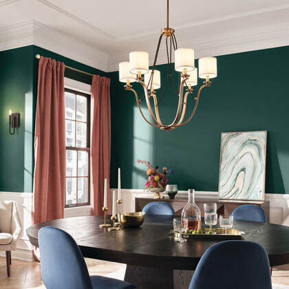
Bold Colors + Controlled Light = Drama & Storytelling
Colors:
- Deep navy
- Forest green
- Charcoal
- Burgundy
Best Lighting:
- Accent lighting
- Wall washers
- Directional fixtures
- Dimmable sources
Emotional Effect: Sophisticated, intimate, intentional
Best Spaces: Dining rooms, powder rooms, entryways, feature walls
Lighting controls the drama. Without it, bold colors can overwhelm.
Layered Lighting Is the Bridge Between Mood & Function
Color sets the tone. Lighting layers allow the mood to shift. In 2026, designers should think in layers, not fixtures:
1. Ambient lighting – overall mood
2. Task lighting – function
3. Accent lighting – emotion and storytelling
A room with only one lighting layer feels flat. A room with three feels alive. This is how designers turn color psychology into a lived experience.
Room-by-Room Mood Strategies for 2026
Let’s translate theory into practical guidance designers can use immediately.

Living Room: Emotional Flexibility
Clients want this room to do everything.
Color Strategy:
- Warm neutrals
- Muted earth tones
Lighting Strategy:
- 2700K–3000K
- Floor lamps, table lamps, sconces
- Dimmers on all overhead lights
Mood Outcome:
- Daytime: welcoming and social
- Evening: calm and restorative

Bedroom: Rest & Recovery
Sleep quality is now a design priority.
Color Strategy:
- Warm whites
- Soft blues or greens
- Avoid overly saturated colors
Lighting Strategy:
- Warm light only (2700K–3000K)
- No harsh overhead lighting over the bed
- Bedside lamps or sconces
Mood Outcome:
- Signals the brain it’s time to rest

Kitchen: Energy Without Stress
The kitchen should feel active—but not chaotic.
Color Strategy:
- Balanced neutrals
- Warm wood tones
- Avoid overly cool whites
Lighting Strategy:
- 3000K–3500K
- Strong task lighting
- Soft ambient layers for evenings
Mood Outcome:
- Focused during the day
- Comfortable at night

Bathroom: Clean, Calm, & Flattering
Bathrooms are about clarity and comfort.
Color Strategy:
- Light neutrals
- Soft stone tones
Lighting Strategy:
- 3000K
- Even lighting at face level
- Avoid overhead shadows
Mood Outcome:
- Clean, spa-like, confidence-boosting
Home Office: Focus Without Fatigue
Lighting mistakes here cause burnout.
Color Strategy:
- Muted blues or greens
Lighting Strategy:
- 3000K–3500K
- Indirect ambient light
- Adjustable task lighting
Mood Outcome:
- Focused without strain
The Role of Tunable White in 2026 Mood Design
Tunable white lighting is becoming more accessible—and more useful.
It allows designers to:
Use cooler light during the day
Shift to warmer light in the evening
Support circadian rhythms
This is especially powerful in:
Open-concept spaces
Home offices
Kitchens
Living rooms
Used intentionally, tunable white strengthens the emotional story of a home.
Common Mistakes Designers Make With Color + Lighting
Even experienced designers stumble here.
Mistake 1: Choosing paint before considering lighting
Mistake 2: Using one color temperature throughout the home
Mistake 3: Ignoring dimming and control
Mistake 4: Overlighting bold colors
Mistake 5: Underlighting warm neutrals
Lighting should be considered with color—not after.
How Designers Can Explain This to Clients
Clients don’t need a science lesson—but they do love understanding why something works.
A simple explanation: “Lighting changes how your brain responds to color. We design both together so your home feels the way you want it to feel.”
That positions you as a thoughtful expert—not just a stylist.
Lighting + Color Is Your Creative Superpower
Anyone can pick a paint color. Anyone can choose a fixture. But when you combine lighting and color psychology intentionally, you create spaces that people feel—even if they can’t explain why. That’s what makes your work memorable.
Frequently Asked Questions
Q: Does lighting really change how color looks?
A: Yes. Color appearance shifts dramatically under different light temperatures.
Q: Is warm light always better for homes?
A: Not always. It depends on function and time of day.
Q: Should every room use the same color temperature?
A: No. Rooms serve different emotional purposes.
Q: Can bold colors work in small spaces?
A: Yes—with controlled, layered lighting.
Q: Is tunable white worth using?
A: Yes, especially in multi-use spaces.
A: Use indirect light, diffusers, and dimmers.
Q: Does color psychology really affect behavior?
A: Yes. It influences calm, focus, and comfort.
Q: Should lighting be planned before paint?
A: Ideally, yes—at least simultaneously.
A: Ideally, yes—at least simultaneously.
Q: Can lighting make neutral colors feel warmer?
A: Absolutely. Warm light enhances warmth in neutrals.
Q: Can LNY Pro help with lighting and color coordination?
A: Yes. We help designers align fixtures, light quality, and finishes.


Ready to Use Lighting + Color Psychology in Your 2026 Projects?
You don’t need to guess how a space will feel. And you don’t need to navigate lighting decisions alone.
The Lighting New York Pro Team helps designers:
Select the right fixtures and color temperatures
Coordinate lighting with finishes and paint
Build layered lighting plans
Explain lighting decisions confidently to clients
Contact LNY Pro today to create lighting designs that don’t just look beautiful—but feel incredible.
Let’s turn mood, story, and emotion into your design advantage for 2026.
Call 844.344.7763 today!